
Featured products
-
Anti-Work Wear Tee - Black
Regular price $38.00 USDRegular priceUnit price per$38.00 USDSale price $38.00 USD -
Stamp Tee - Navy
Regular price $38.00 USDRegular priceUnit price per$38.00 USDSale price $38.00 USD -
Stamp Tee - Black
Regular price $38.00 USDRegular priceUnit price per$38.00 USDSale price $38.00 USD -
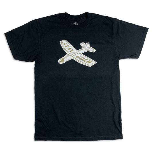
Stay Gold Glider Tee - Black
Regular price $38.00 USDRegular priceUnit price per$38.00 USDSale price $38.00 USD -

 Sold out
Stamp Beanie
Regular price $28.00 USDRegular priceUnit price per$28.00 USDSale price $28.00 USDSold out -
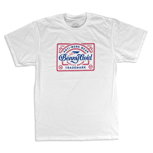
Anti-Work Wear Tee - White
Regular price $38.00 USDRegular priceUnit price per$38.00 USDSale price $38.00 USD -
Stamp Polo Hat
Regular price $42.00 USDRegular priceUnit price per$42.00 USDSale price $42.00 USD -
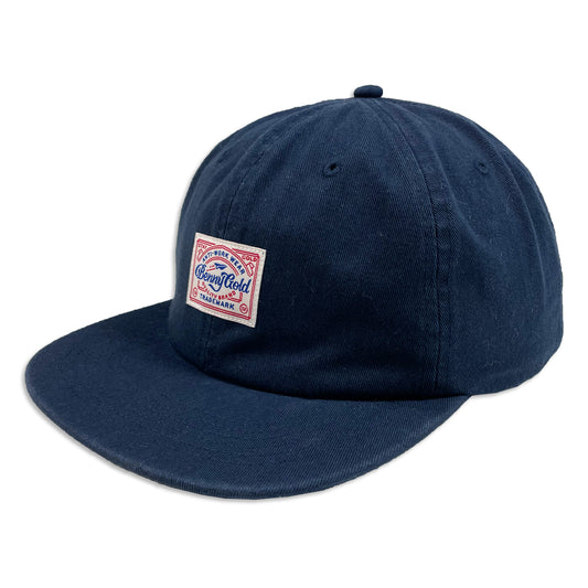
Anti-Work Wear Polo Hat
Regular price $42.00 USDRegular priceUnit price per$42.00 USDSale price $42.00 USD -
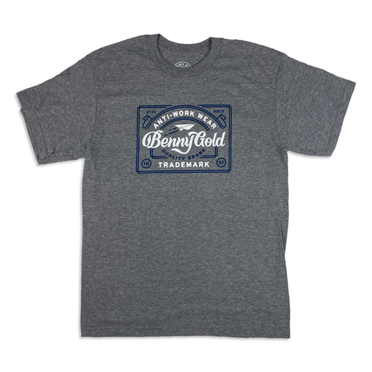
Anti-Work Wear Tee - Heather
Regular price $38.00 USDRegular priceUnit price per$38.00 USDSale price $38.00 USD -
Digi Fog Camo Oversized Tote
Regular price $60.00 USDRegular priceUnit price per$50.00 USDSale price $60.00 USD -
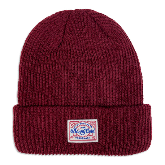
Anti-Work Wear Beanie
Regular price $28.00 USDRegular priceUnit price per$28.00 USDSale price $28.00 USD -
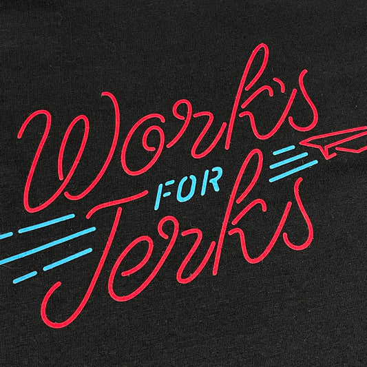
Works For Jerks Tee - Black
Regular price $38.00 USDRegular priceUnit price per$38.00 USDSale price $38.00 USD